
Blue Living Room: Soft Geometry, Confident Color, Real-Life Comfort
A serene blue envelope, a deeper-blue fireplace focal, and a bold red sectional prove that calm and charisma can live in the same room. Soft curves, layered light, and flexible seating make this space as functional as it is photogenic.
The Color Story: One Hue Family, One Clear Pop
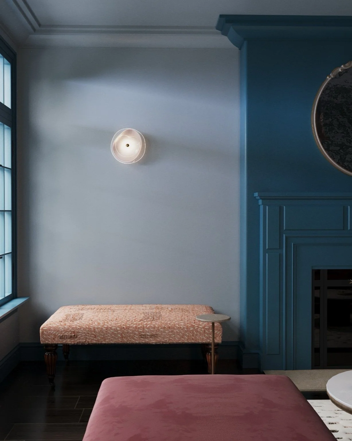
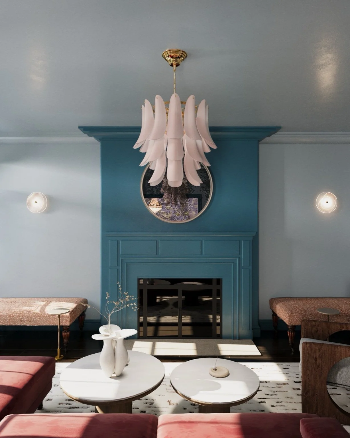
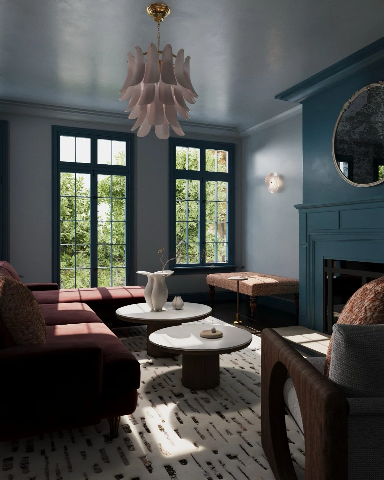
We wrapped the room in a warm, sky-blue envelope (walls + ceiling) for a light, uplifting base. The fireplace wall in a deeper blue creates instant focus and anchors the layout. Soft blush tones in the chandelier and sconces bridge the palette. Then a red sectional adds energy and contrast—just enough drama to keep the room lively without overwhelming the calm.
Soft Geometry Ties It Together
From rounded coffee tables to a sculptural armchair with a circular cut-out, every major piece repeats a gentle curve. Even the fireplace corners are eased, so profiles feel welcoming, family-friendly, and cohesive from every angle.
Symmetry + Flexibility for Hosting
The fireplace reads as the “hero wall,” framed by sculptural sconces for elegant symmetry. A pair of ottomans on casters flank the hearth—extra seats that roll in when friends arrive and tuck away when you want breathing room.
Comfort You Can Fee
A plush, patterned rug grounds the seating group and softens acoustics. Subtle brass accents and a lightly antiqued round mirror above the mantel add depth and a refined glow—especially at night with layered lighting.
Why We Always Render Before You Buy
3D visualization lets you test scale, layout, color, and lighting in your actual room—before you commit. That means the sofa truly fits, the rug size is right, and finishes play nicely together. In short: buy once, no regrets. If you’d like to see your own space in 3D first, I can create a tailored visualization and shopping plan.
FAQ
Will deeper blue make the room feel dark?
Not here: the darker blue is limited to the focal wall. The rest of the shell stays light, so the space remains airy while gaining definition.
Is a red sofa hard to live with?
It’s surprisingly versatile when the rest of the palette stays disciplined (blues + blush + brass). The red works as a confident accent, not a clash.
Work With Us
Ready for a living room that’s calm, welcoming, and smartly planned? Book a design consultation or request a 3D visualization to preview your choices before you invest.